Please enter password
Designing Cross Platform User Experience for The Ken
Project Overview
Website:
Timeline: 15 months
Team: Aakash Rodrigues, Gauri Girish, Poorti Purohit
Created at:
What I worked on
UX design
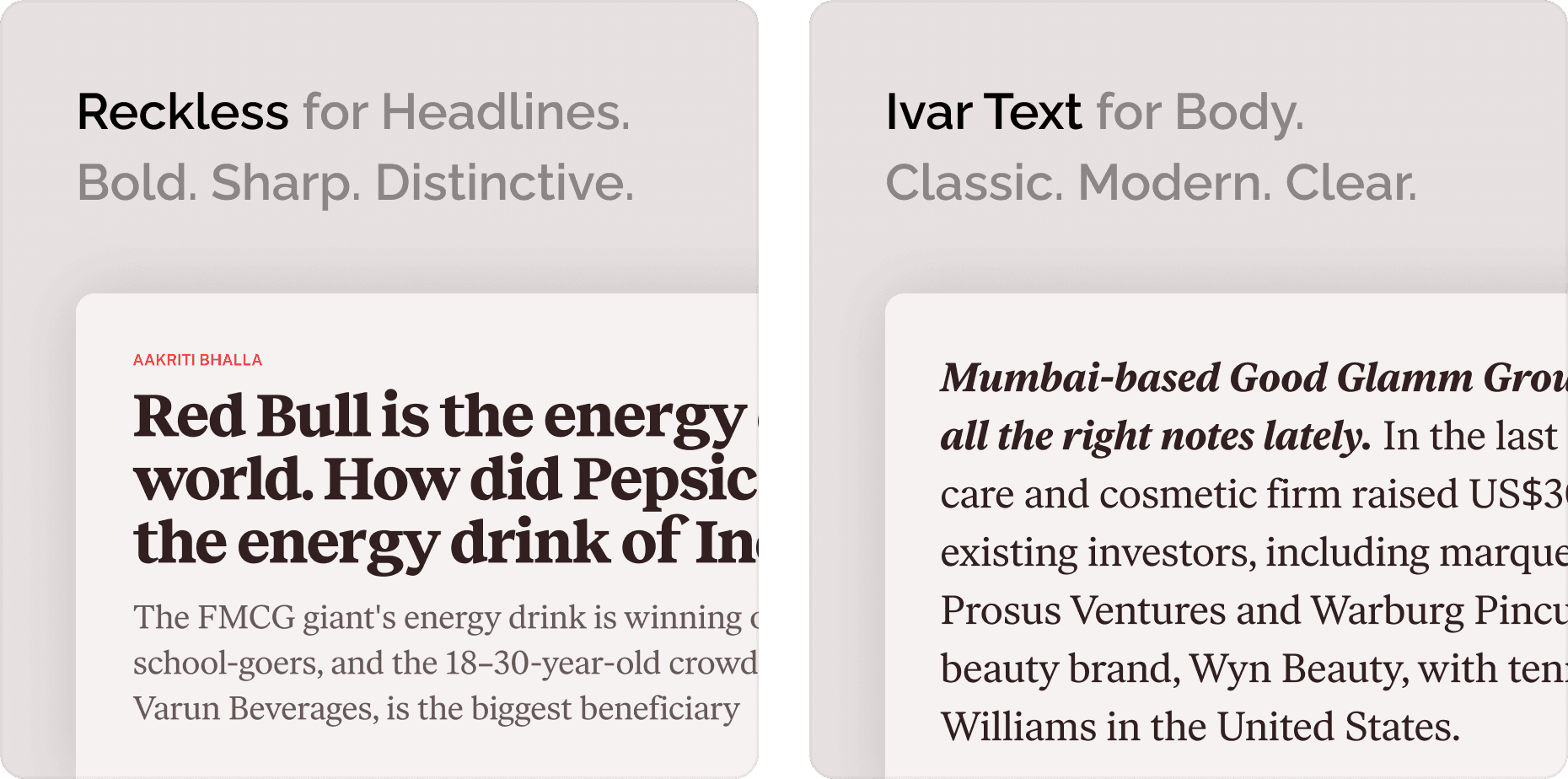
Visual language and design system
Website design
Android, iOS & iPadOS app design
Usability testing
Context
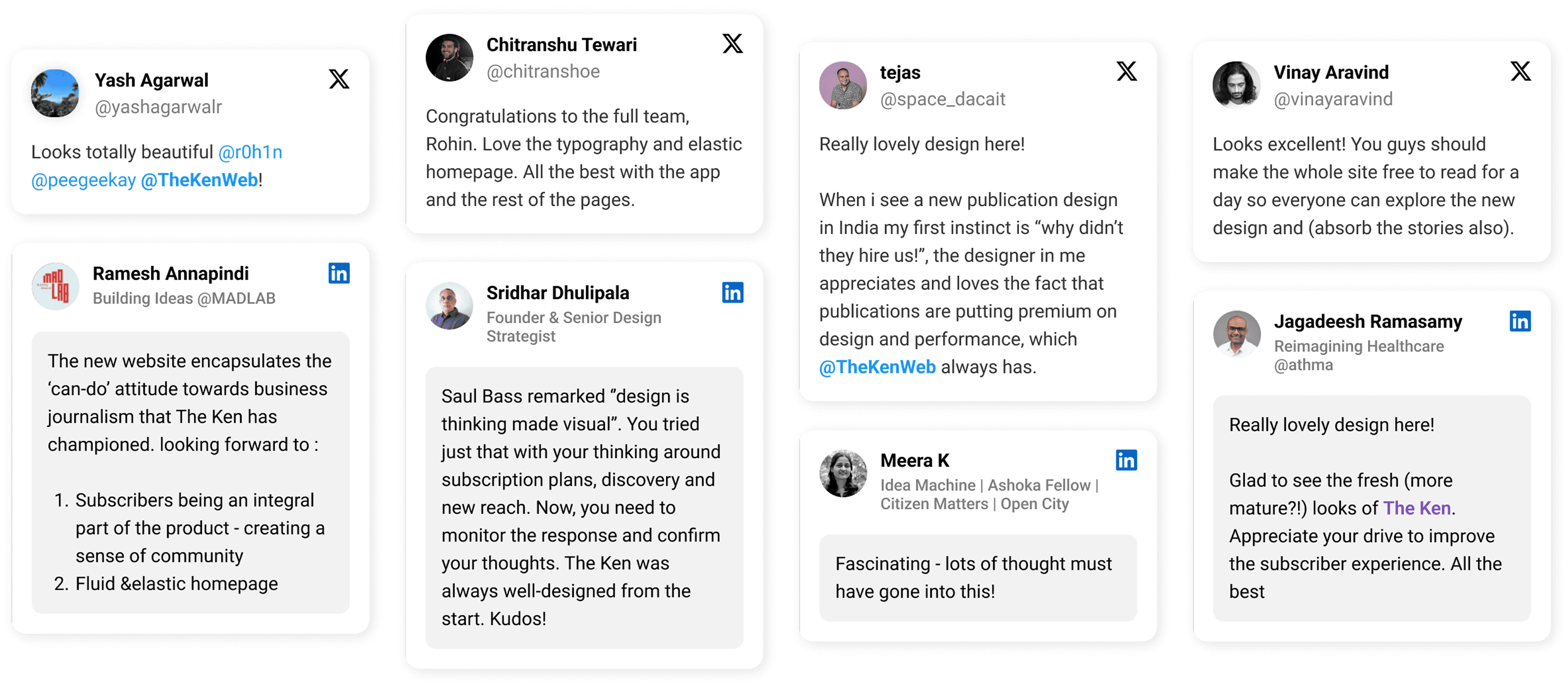
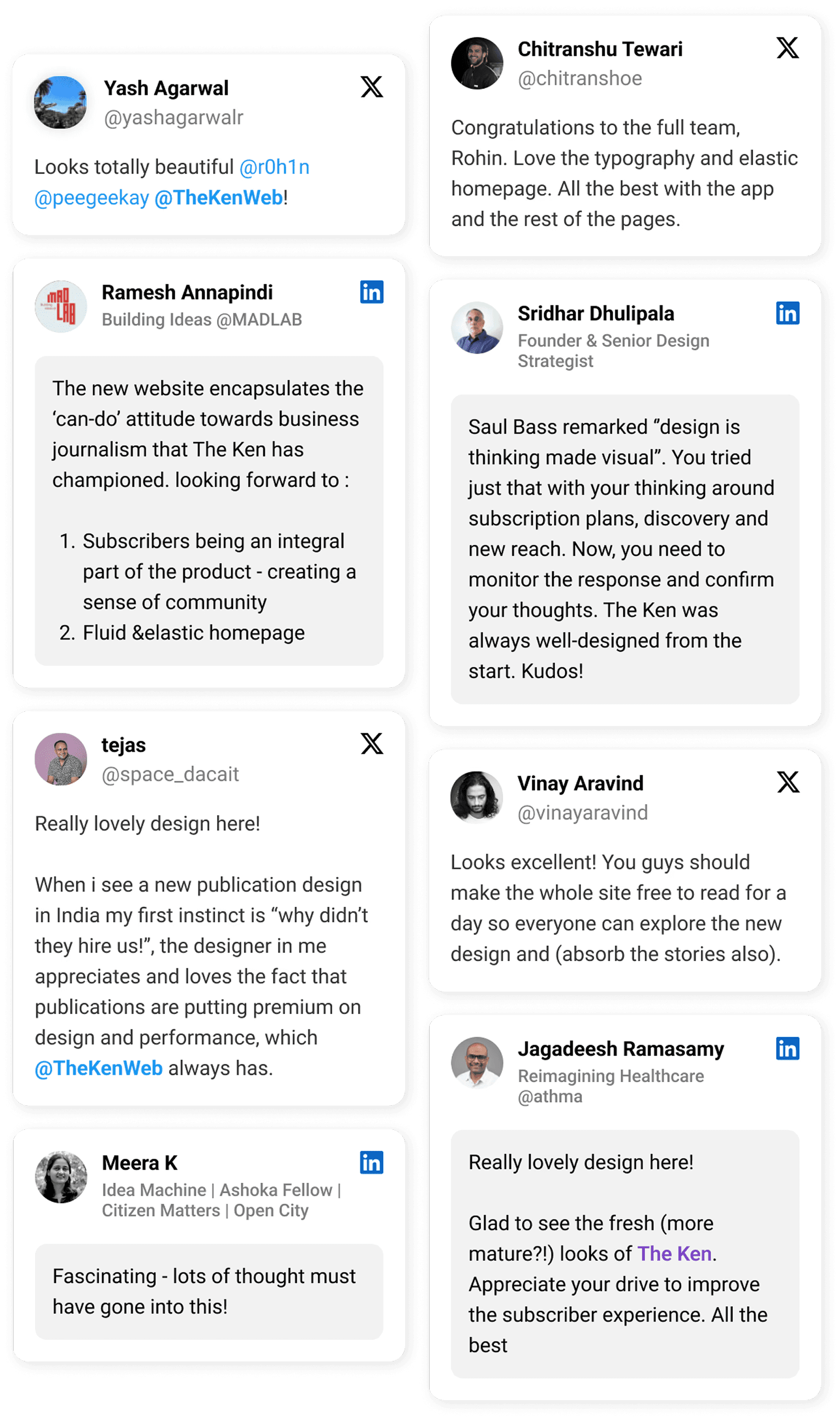
Impact & Reception
qualitative Research
Understanding the User
To ground the redesign in real user behaviour, we interviewed teams at The Ken to understand what patterns they have observed in their audience’s feedback, email correspondence, and social media interactions
Key insights:
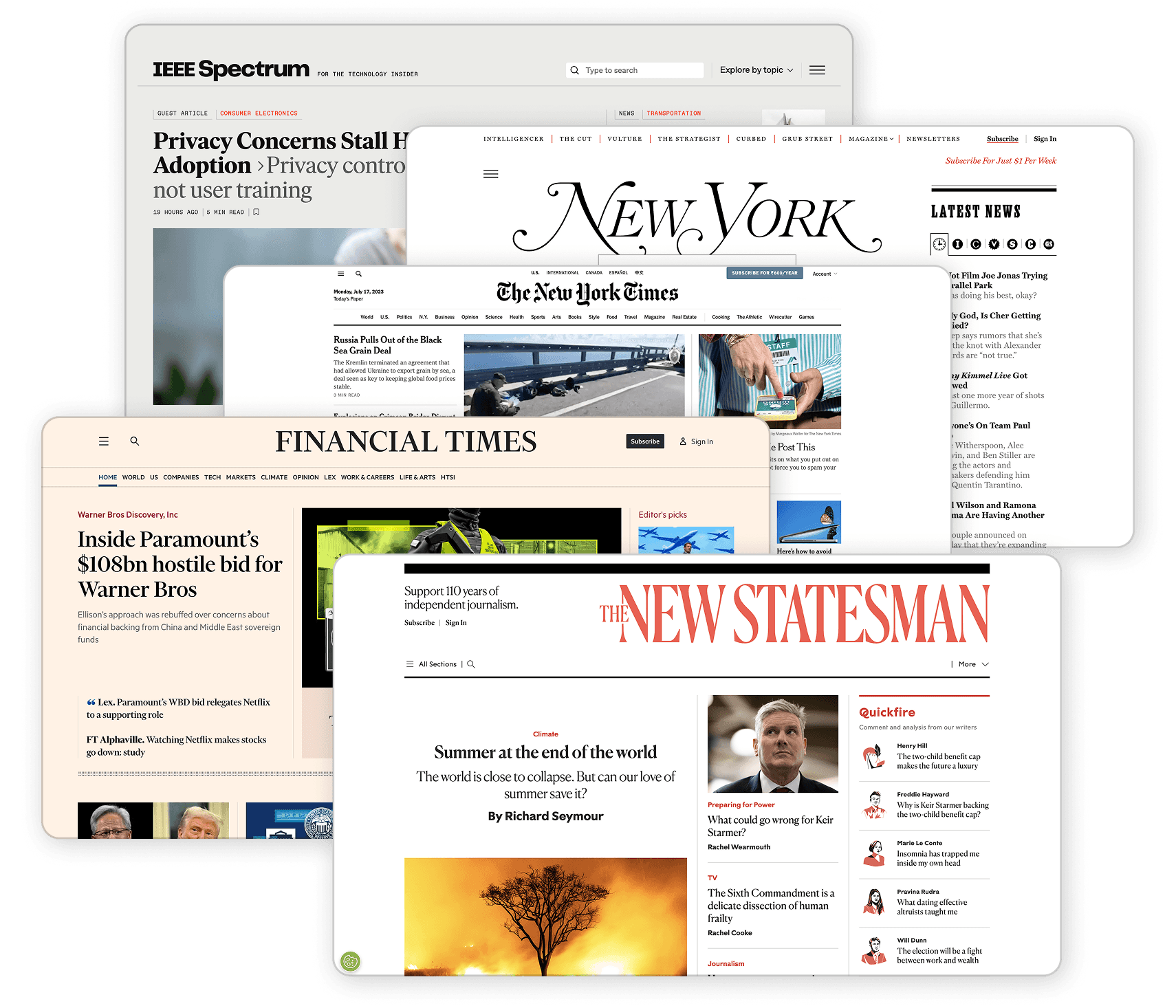
peer analysis
Understanding other publications
While The Ken doesn’t have direct competitors, we studied globally respected publications. This guided our choices around hierarchy and readability.
We analyzed elements such as:
Page and article layouts
Typography hierarchy
Section density and spacing
Text-to-image ratios
Navigation styles in long-form journalism
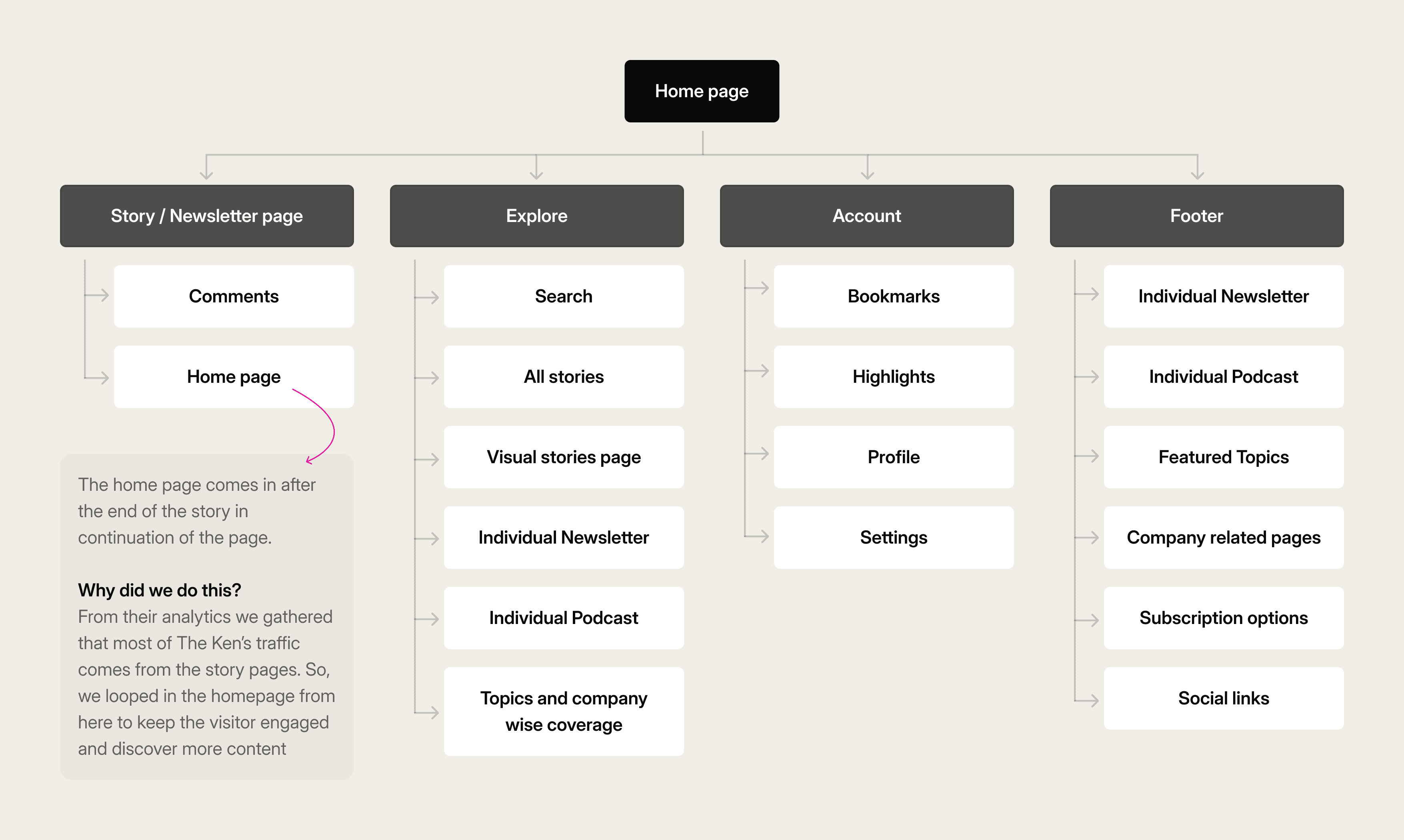
information architecture
Organising the website
We simplified and restructured the website to create a clearer, more intuitive navigation system. The goal was to help users explore effortlessly while maximising content discovery.
Visual Design
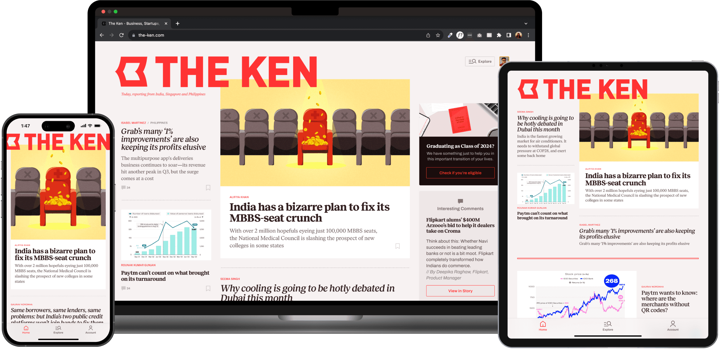
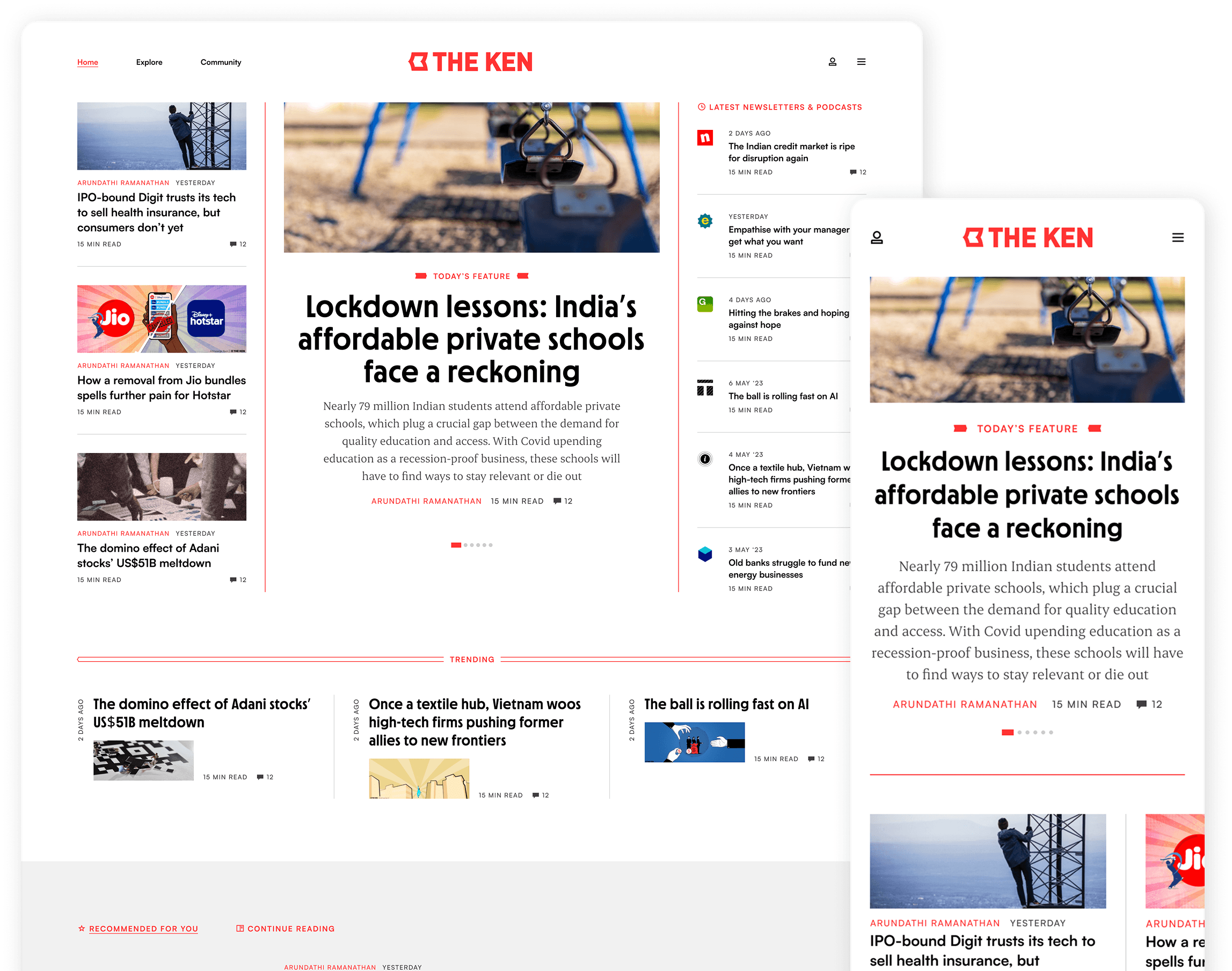
The Ken Home Page
As the most important touchpoint of the website, designing the homepage was a huge and exciting challenge. We re-imagined everything from the sections that need to be displayed to the layouts and drilling down to each element in the story units.
Design goal was to create a Homepage that:
Feels premium, distinct, and handcrafted
Encourages content discovery across formats
Balances predictability & novelty
Shows community engagement
UX design and decisions
Homepage design iterations
Visual Design
The Ken Mobile App
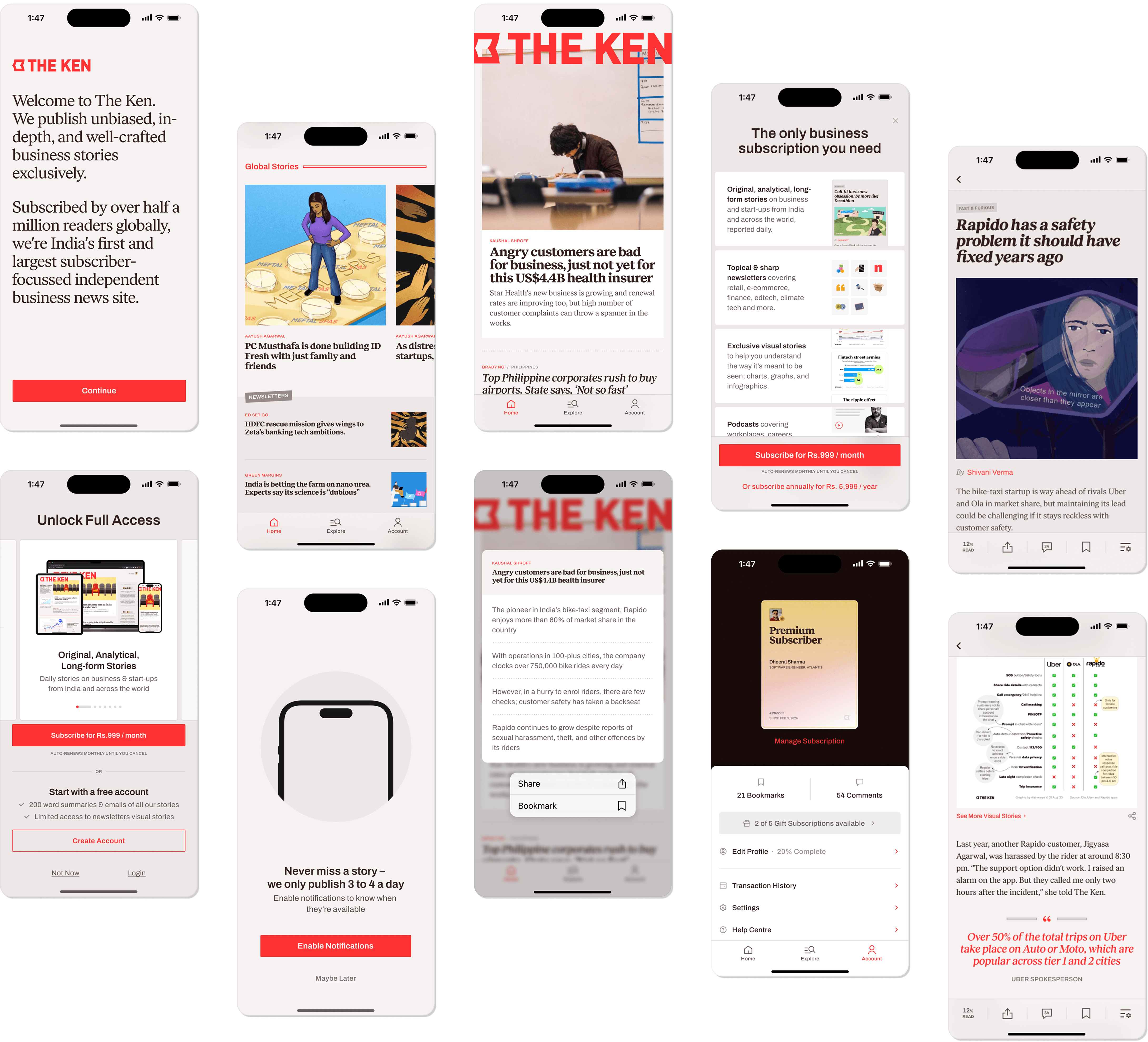
Some of the app pages mirrored the mobile web design, but we refreshed key experiences to enhance the app's delight and usability.
Onboarding Flow
We designed the onboarding flow to clearly communicate what The Ken is about and it’s offering without being tediously long
Subscriber Card
Instead of subscribers being shown the usual “payment successful” message, we created Cards that recognise them as members of an exclusive set of individuals instead
Visual Design
The Ken Pricing Page
Redesigning the Pricing Page was a unique challenge. In order to position The Ken as a premium publication, we ensured users clearly understand the value behind a subscription.
Design goal:
Promote subscription value over features
features available in different plans are not vastly different so our focus was on highlighting the value of each plan.
Avoid traditional table layouts
Text-heavy format that demand more mental effort, we made a visual, scannable design that's easy to grasp at a glance.
Visual Design
The Ken Story Page
The story page received a visual refresh. We also introduced new user features to boost subscriber engagement and interactivity.
Design goal:
A flexible hero section that accommodates extra information.
Put the author in focus for greater visibility.
Encourage readers to engage with the content
UX design and decisions
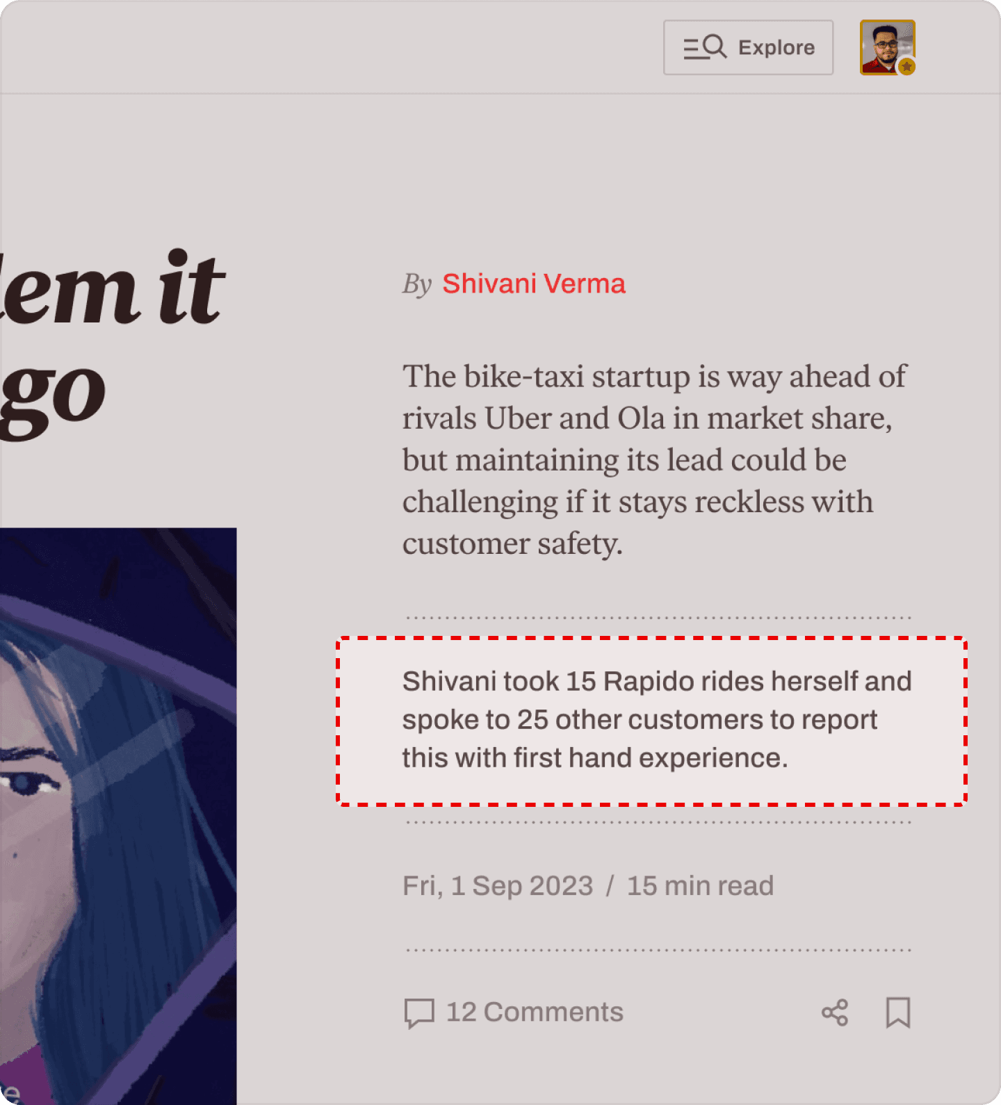
A flexible hero section accommodates extra information
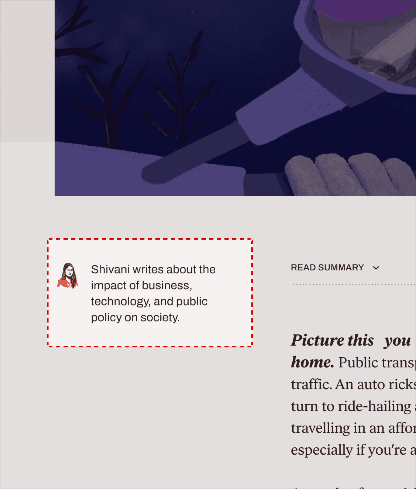
Focus on author for greater visibility
Allocating space for authors allows us to showcase brief descriptions, enhancing credibility and emphasizing the human touch in the AI era.
Promoting subscriber engagement
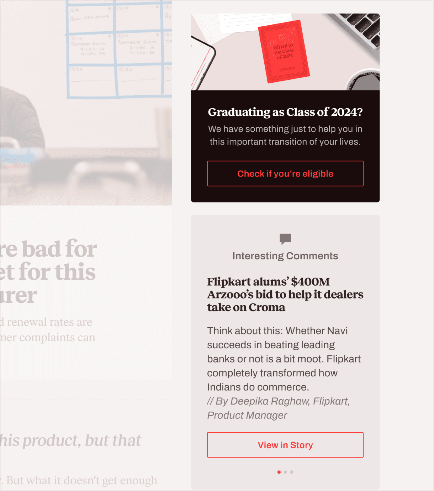
The Ken’s subscribers enrich The Ken’s reading experience by adding another layer of context & perspective. So we built a new commenting, highlighting and sharing system that deeply integrates the subscribers’ interactions into the stories.
In-line comments
lets users share their opinions on specific parts of a story
Sharing and taking screenshots
made seamless with just a single click
Highlights
allow users to save key takeaways to refer to in future
Visual design translation
Designing other pages and sub-projects
The same principles of our website design were then carried forward to related pages under The Ken
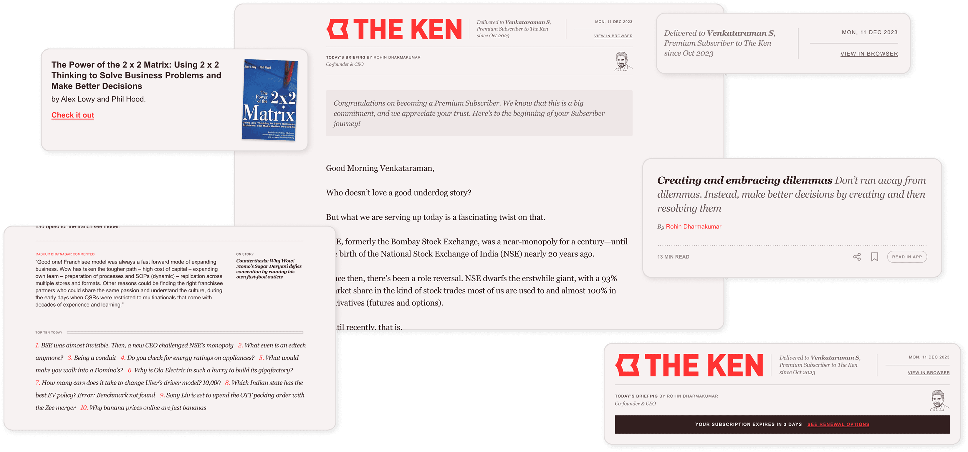
The Ken’s email format
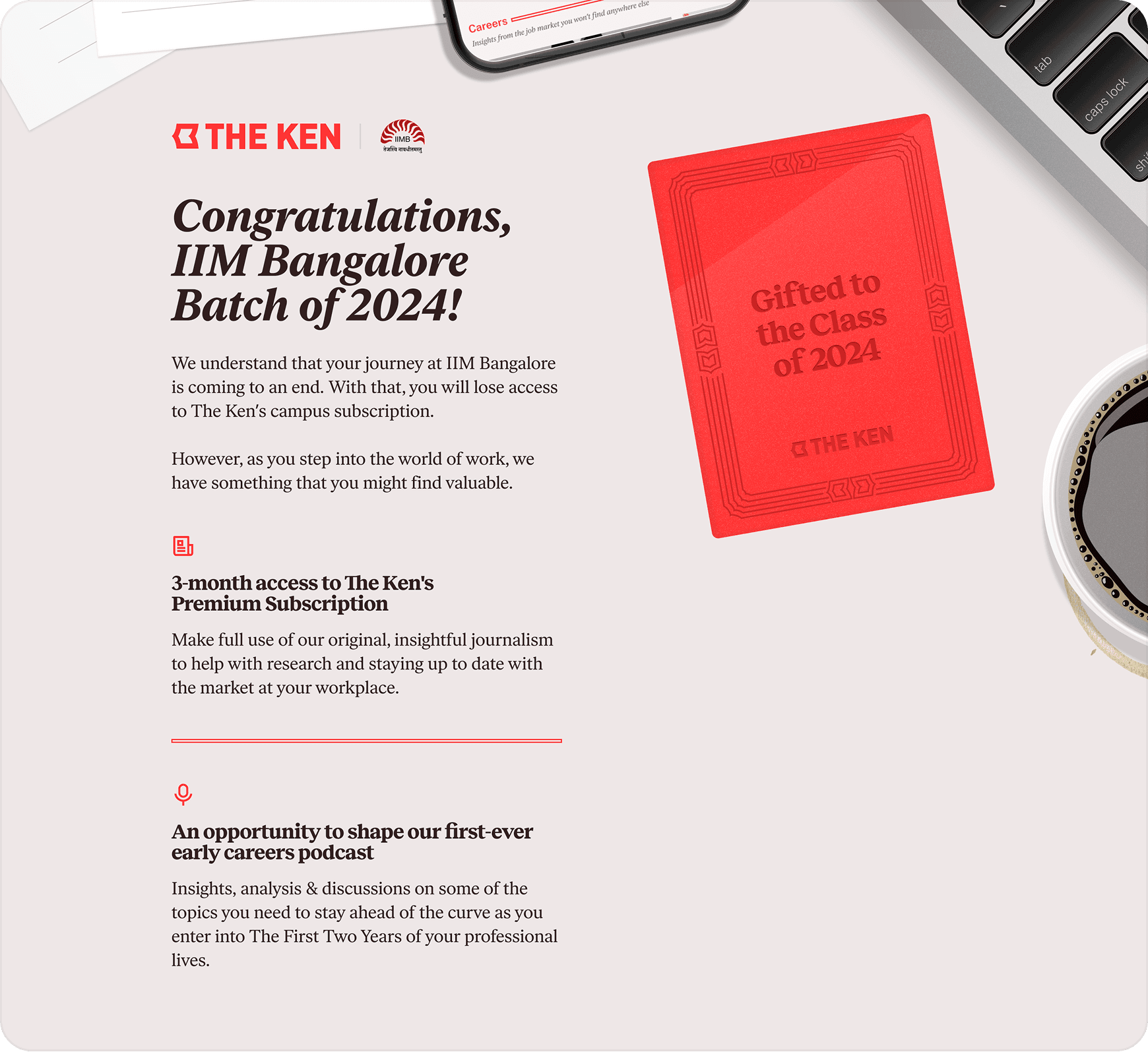
Special 3-month access page for graduating students
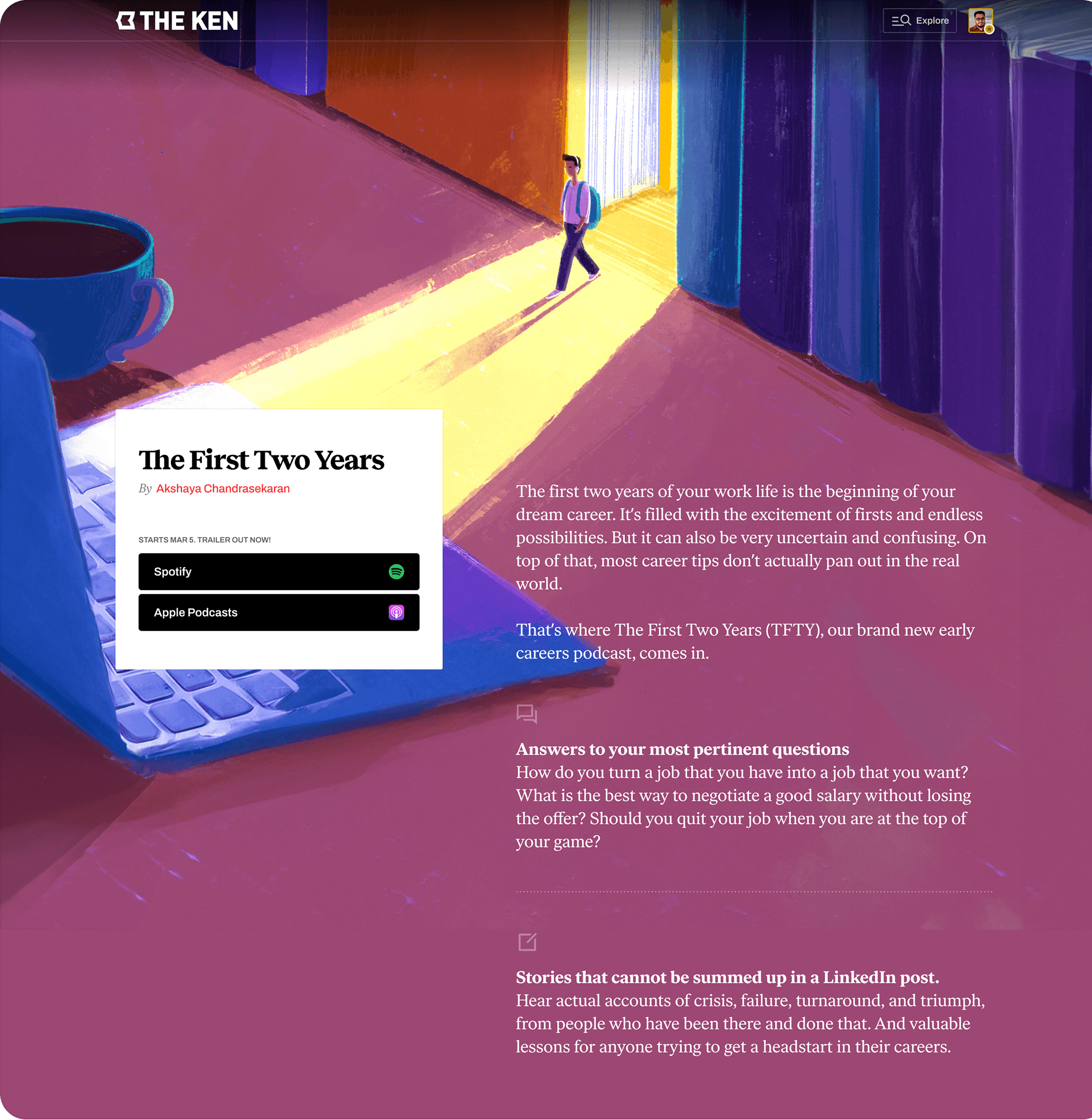
Podcast page template
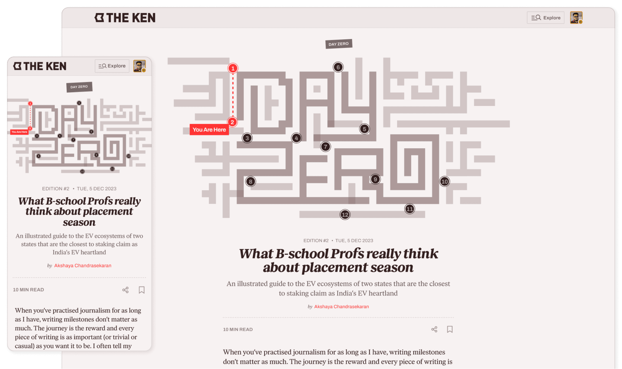
Newsletter page template
